Digital Disease Quantification in plants, a tailored high throughput method
A few months ago, I received a request from a client asking if we could help to improve their disease quantification process with PlantEye. They reached their limit of the number of plants they could visually score and were looking for an automated high throughput solution. They already invested resources attempting to automate their process but where still not able to detect and score the disease symptoms. Currently, they are still scoring the plants visually.
In the past years we have learned a lot about quantifying disease symptoms with our PlantEye sensor, but we still strive to tailor our solution to the specific needs of each client. Our approach takes into account their different methodologies, different species and diseases on which they are working. Therefore we decided to jump on this and help to develop a disease quantification method in collaboration with our client. Below is a description of how we did it.
Since we first wrote this blog we also implemented machine learning solutions to, among other applications, automate disease pressure scorings. Our software learns from the scorings of your experts and then predicts these scorings based on PlantEye data. Contact us to learn more about this solution.
Experiment
For the question at hand, we had cabbage and cauliflower supplied by the client at our disposal. The plants were contaminated with different degrees of a pathogen. This pathogen develops into the Xanthomonas disease on plants.
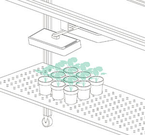
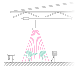
The disease symptoms were assessed visually by an expert using a score of 1-10. After the visual scoring we used our PlantEye to also “score” the plants using its 3D + multispectral capabilities.
Digital disease quantification
Our first step to digitally quantify the disease was to explore the data PlantEye generated for this experiment. Prior knowledge informed us that the spectral parameters we provide are interesting candidates. We chose to evaluate the following three spectral parameters:
- NDVI (Normalized Difference Vegetation Index, indicator of plant damage)
- Hue (Color scale)
- Greenness (ratio of green color versus red and blue color)
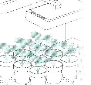
After a first evaluation we decided to use the NDVI parameter because the NDVI values are mostly affected by the disease. I will show you why. In figure 1 you have 3D models of the cabbage plants. These models are colored according to the NDVI values generated by PlantEye.
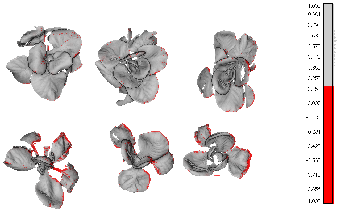
Figure 1 – 3D Scan with NDVI coloring. The infected leaf tissue has a low NDVI value (< 0.15) and is colored in red
The leaf tissue colored in red is the leaf tissue carrying the disease symptoms. You can clearly see that the top row of plants has fewer symptoms as compared to the lower row of plants. Red means a NDVI value of 0.15 or less and indicates the disease symptoms on the leaves.
A person would then score the above images visually. These results would still not be objective and tangible. For instance, it is possible that when you are happy you would score them a 6 and when you are tired you score them a 5. Also, you still don’t know exactly how much of the plant is showing disease symptoms.
This is exactly what PlantEye does for you. It quantifies the amount of leaf tissue with low NDVI values. For this we use “binning” which I will explain in more detail.
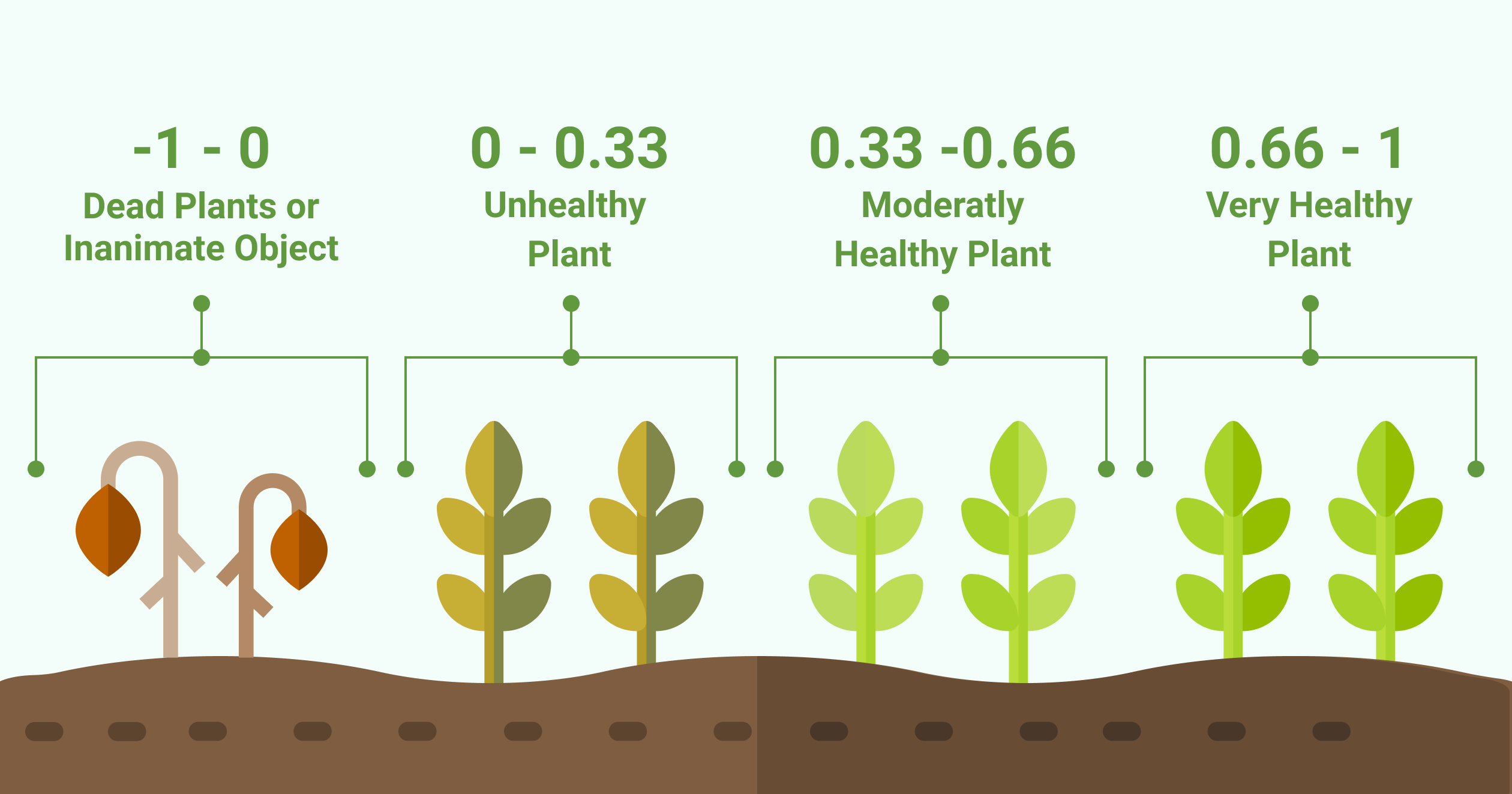
Figure 2 – How NDVI values relate to the health of the plant
Quantify unhealthy plant tissue with “binning”
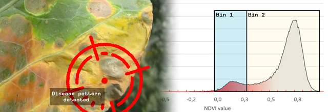
To explain how we quantify unhealthy plant tissue we use histograms of the plants in the 3D image (figure 1). We grouped the data of the three healthy plants in the top row. These show the following distribution:
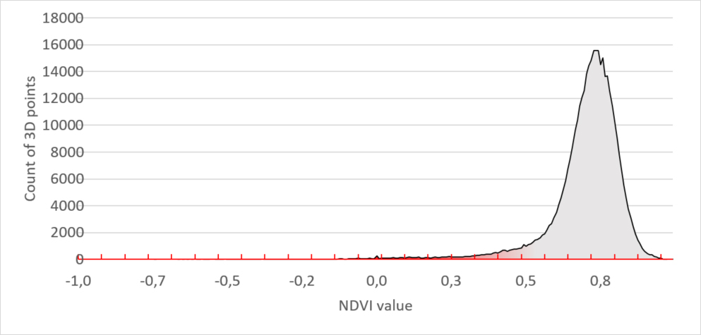
Figure 3 – Healthy plants NDVI signature
The “unhealthy” plants in the lower row have a different histogram. It has a smaller main peak and a second peak in the region between 0 and 0.3. Leaf tissue with this NDVI value is unhealthy.
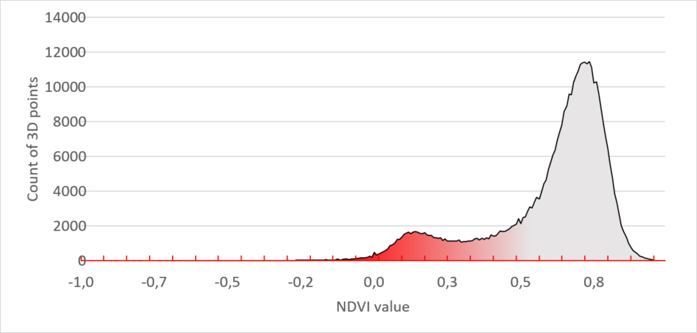
Figure 4 – Unhealthy plants NDVI signature
When comparing both histogram you can visually see the proof that the unhealthy plants have much more diseased tissue which results in a bigger red peak. But still, to quantify it, we need to put a number to it.
To do so we introduced a binning system. On the image below we placed 2 bins, each covering an area of interest. Bin 1 contains all leaf tissue that has a NDVI value between -0,06 and 0.33. When we compare the leaf tissue in Bin 1 with the leaf tissue of the entire plant, we get a percentage. Now we really have a tangible number and can say that Bin 1 contains x% of the leaf tissue. When the bins are carefully set, to the areas of interest for your disease, you can say x% of the plant is showing the disease symptoms.
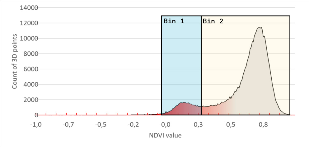
Figure 5 – digital disease quantification – Binning on NDVI histogram signature
For instance, we set the range of Bin 1 to NDVI values between 0 to 0.3. We chose this range because it is the area of interest for the disease you are scoring. Our software HortControl uses this range and calculates that Bin 1 holds 5.41% of all leaf tissue with these NDVI values (22 Aug, 19:00 on the graph below). If you then multiply the value of 5,41% with the total 3D leaf area, you get the absolute number of leaf tissue affected by the disease.
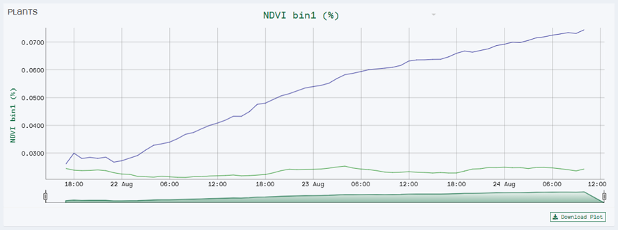
NDVI Bin 1 visualizes the progression of diseased leaf tissue in percentage of the whole plant over time. In this case we have two treatment groups where the blue line represents the group of plants inoculated with the disease.
Correlation between Manual vs Digital scoring
For the final step, we had to check the correlation between the NDVI values of PlantEye and the manual scoring of our client’s experts. The results showed a R2 score of 0,9 with a highly significant p-value of < 0,01.
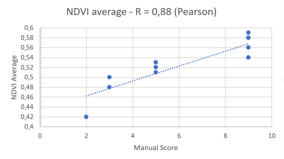
Figure 5 – Scatterplot of NDVI with regression line
Results
The results show that we are able to detect and quantify leaf tissue with Xanthomonas symptoms already in early stage and that we are able to quantify the diseased tissue in a very accurate way. I am happy that we could convince our client and prove to him that the results are reliable and reproducible and that we could find a solution to their problem.
Translating the values of sensors into a phenotyping score is never an easy task as many things have to be considered. Beside the plant species and the disease the scoring method and the setup is of high importance and also have to be considered. This means we still need a close collaboration with our clients. We have the technical- and biological knowledge and passion and can help you to make digital plant phenotyping a valuable tool for your research. So now I am curious, what is your challenge?
Kind regards,
Alexander den Ouden
Technical sales manager
High-tech phenotyping equipment is increasingly adopted to improve the phenotyping process. That means you have access to multiple objective parameters in a very high frequency, 24/7.